Kind of Hard Not to See a Pattern Here…
17/04/2013 3 Comments

Lineage?
So, I was reading some articles on space exploration yesterday (as you do!) and I began to see an interesting pattern as regards space agency insignia. The logos of all the more prominent agencies seem to revolve (or orbit, if you will) around a predictable group of symbols – planets, stars, aspirational arrowheads – but, more than that, they all seemed to be leading inexorably towards Star Trek‘s fictional Starfleet emblem.
While I’d long be familiar with the NASA and Roscosmos logos and have noticed the slight resemblance before, the emblem of the Chinese National Space Agency has a real “Missing Link” quality to it given how closely it resembles the Next Generation era combadge/Starfleet insignia.
A little more Googling has turned up the following about the symbolism of the various logos:
NASA Insignia:
Wikipedia informs me (so it must be true, right?) that the NASA insignia displays a sphere to represents a planet, stars to represent space, a red chevron – in the alternate shape of the constellation Andromeda – as a wing representing aeronautics (as it resembled the latest design in hypersonic wings at the time the logo was developed), and, finally, an orbiting spacecraft going around the wing. NASA’s round logo has long been nicknamed the “meatball”. Bonus fun fact: The meatball adorns the mug I’m drinking out of right now!
Russian Federal Space Agency Logo:
This one is tougher. I’ve been able to find out nothing about the Roscosmos logo (Jeez, Russia, paranoid much) but I know that it is relatively recent, the agency being established in 1992 to take the place of the old Soviet Space Program (who, of course, had a very Soviet logo). It’s tempting to assume that the Roscosmos insignia has a similar symbolism to that of the NASA meatball; a planet (or an orbit) and a wing (or possibly a star). Maybe it even takes its inspiration from it, though that’s just supposition on my part. After all, there were other things going on in the early 90s (let me get back to that).
Chinese National Space Administration Logo:
This is a good one. Wikipedia says the CNSA’s logo displays an “arrow in the middle with a similar shape as the Chinese character 人 which means ‘human’ or ‘people’, to state that human is the center of all space explorations. The three concentric ellipses stand for three types of Escape Velocity (minimum speed needed to reach sustainable orbits, to escape the earth system, and to escape the solar system) which are milestones of space exploration. The second ring is drawn with a bold line, to state that China has passed the first stage of exploration (earth system) and is undergoing the second stage exploration (within the solar system). The 人 character stands above the three rings to emphasize humanity’s capability to escape and explore. Olive branches were added to state that China’s space exploration is peaceful in nature” or, as one of my friends remarked on Facebook, to indicate that the CNSA “might endorse a movie or something”.
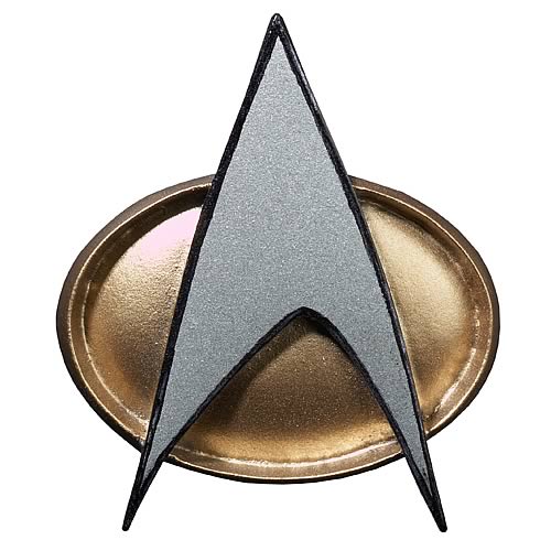
Starfleet Emblem:
The only fictional insignia here, the well-known Starfleet delta shield was created in 1964 by William Ware Theiss when he designed the uniforms for the original Star Trek series (thank you, Memory Alpha). At first this was the insignia of the Enterprise alone but it was later adopted by the entire organisation in honor of the achievements of that ship and crew. Mike Okuda, one of the franchise’s leading graphic designers (and who may have a character named after him in the novel I’m working on, shush!), described it as follows: “A dramatic free-form arrowhead pointing symbolically upward to the heavens.”
So…
Any sense of evolution from one logo to the next is presumably a case of apophenia on my part, however it’s worth nothing that the NASA meatball was designed by James Modarelli in 1959 and presumably would have been familiar to Theiss, Gene Roddenberry, and others involved in the original Star Trek series. That original arrowhead was revised in 1987 for Star Trek: The Next Generation, a series at the height of its fame in the early 1990s when Roscosmos and the Chinese National Space Agency came into being (1992 and 1993 respectively) and, while it might be possible to claim an independent development for the Roscosmos logo (or at least one influenced by the symbolism of the NASA logo), I think both it and especially the Chinese logo bear a remarkable similarity to the 90s Starfleet delta shield…
There’s probably something really interesting to be written about the interplay between real-life and fictional space program/military iconography, especially in terms of feedback between the two (or even feedback between real life insignia and popular culture in general; I’m thinking of the licensed appearance of Daffy Duck and Marvin the Martian on the mission patches for NASA’s Mars Exploration Rovers). More than a blog post in that, mind, so for now I’ll just add it to the ever-growing Things-to-Think-About list.
___
Other posts you may enjoy:
- ‘Subversive Critique of the Established Order’: My Irish Examiner review of Wool by Hugh Howey.
- A Guide to Humanity’s Next 100,000 Years: Thoughts on New Scientist’s ‘Deep Future’ Issue.

Fascinating! I never noticed that before. 🙂 Thanks for sharing.
You’re very welcome!
Reblogged this on snoozeyalose and commented:
Interesting pattern! Thank you for sharing. 🙂